Mastering Color Theory in Photography
The complete guide to color theory for photographers. Understand the color wheel, harmonies, and psychological impact of colors in your images.
Introduction
Color theory is fundamental to photography. Understanding how colors interact, complement, and contrast with each other allows photographers to create more impactful and emotionally resonant images. This comprehensive guide covers everything you need to know about color theory in photography.
The Color Wheel
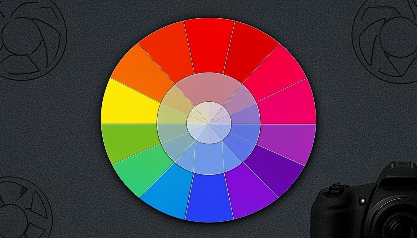
The color wheel is the foundation of color theory. It organizes colors in a circle, showing the relationships between primary, secondary, and tertiary colors.
Primary, Secondary, and Tertiary Colors
- Primary colors: Red, blue, and yellow — cannot be created by mixing other colors
- Secondary colors: Green, orange, and purple — created by mixing two primary colors
- Tertiary colors: Created by mixing a primary and a secondary color (e.g., red-orange, blue-green)
Warm and Cool Colors
Colors are divided into warm (red, orange, yellow) and cool (blue, green, purple) tones. Warm colors evoke energy, passion, and warmth, while cool colors suggest calm, serenity, and distance.
Color Harmonies
Color harmonies are proven combinations that create pleasing visual effects.
Complementary Colors
Colors opposite each other on the color wheel (e.g., red and green, blue and orange). They create maximum contrast and vibrancy. Use complementary colors to make subjects stand out.
Analogous Colors
Colors adjacent on the color wheel (e.g., blue, blue-green, green). They create harmonious, soothing images with a sense of unity.
Triadic Colors
Three colors equally spaced on the color wheel. They create vibrant, dynamic images with strong visual contrast while maintaining balance.
The Psychology of Color
Colors evoke emotional responses. Understanding color psychology helps photographers convey the right mood.
Red
Passion, energy, danger, love. Use sparingly as it immediately draws the eye.
Blue
Calm, trust, professionalism, serenity. The most universally liked color.
Yellow
Optimism, joy, warmth. Can be overwhelming in large amounts.
Green
Nature, growth, harmony, freshness. Easy on the eyes and widely used in landscape photography.
Applying Color Theory in Photography
Understanding theory is one thing; applying it is another. Here are practical tips for using color theory in your photography. Tools like AllCombiner can help you explore color combinations in your image fusion work.
Choose a Dominant Color
Select one dominant color for your image, then use complementary or analogous colors as accents. This creates a clear visual hierarchy.
Use Color Temperature
Balance warm and cool tones to create depth and dimension. A warm subject against a cool background creates a sense of separation.
Post-Processing Color Control
Use editing software to fine-tune colors. Adjust hue, saturation, and luminance to achieve the desired emotional impact. Explore pricing options for professional tools.
Conclusion
Color theory is an essential skill for any photographer. By understanding how colors interact and the emotions they evoke, you can create more powerful, intentional images. Whether you're shooting portraits, landscapes, or creative compositions, mastering color theory will elevate your photography to new heights.
Related articles